Last week there was an article in the Washington Post titled This is the one map you need to understand Ukraine's crisis. The "one map" is actually two maps, both with fairly awful color and symbol choices.
 First, there's the color scheme. The orange is fine but the blue is way too similar to the water. So similar that the Sea of Azov (between the Crimean Peninsula and the easternmost provinces) looks like a province that was won by Yanukoyvich. Looking from a distance you can see that he also won that huge southern region - oh wait, that's the Black Sea!
On top of this confusion, the author represents the areas of protests with diagonal lines that are so fat you lose the light-dark orange pattern of support for the "pro-Europe" party. He could have thinned these lines to make the map more readable. Better yet, since protests happen in isolated places a point symbol would illustrate them without confusing the color scheme. If you want to be dramatic, use a nice explosion symbol like this one.
 Finally, there's Kiev. The black line pointing to it is the same color and angle as the government centers seized by protesters symbol, making it look like it's been seized. In fact, some government buildings in Kiev have been seized so maybe the author was trying to be ambiguous.
The second map is a linguistic map with the same color scheme. The article does succeed in showing that the political and linguistic divisions break along the same provincial lines. All other information is obscured by bad cartography.
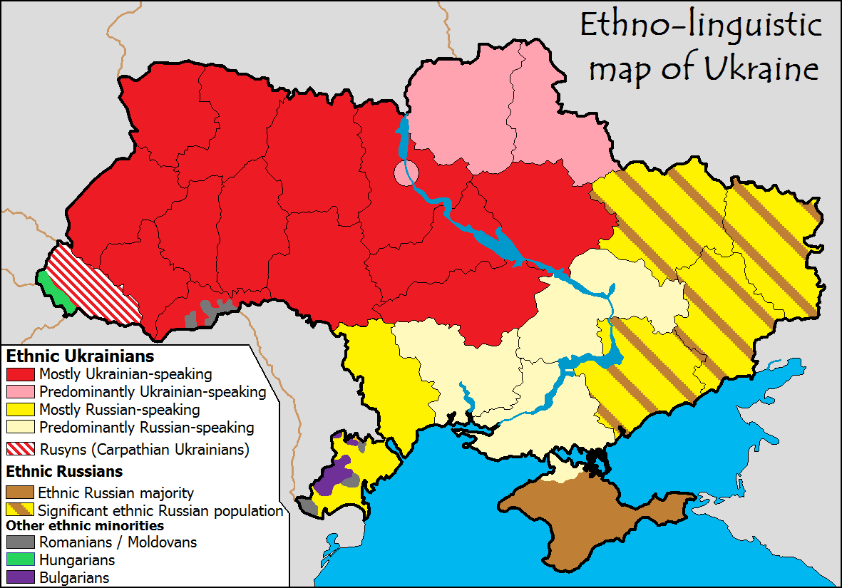
It's really too bad they did such a poor job with this because just last month the same author presented a similar series of maps that are much more legible. In an article with a similar title, This one map helps explain Ukraine's protests, he uses a similar election map but with a slightly better purple color scheme for the Yanukoyvich vote. This time the "one map" is actually three maps, two election maps and an "ethno-linguistic" map from Wikimedia Commons. The linguistic map does explain the divide nicely though the categories are a bit vague (predominantly vs. mostly vs. ethnic majority - huh?)


On top of this confusion, the author represents the areas of protests with diagonal lines that are so fat you lose the light-dark orange pattern of support for the "pro-Europe" party. He could have thinned these lines to make the map more readable. Better yet, since protests happen in isolated places a point symbol would illustrate them without confusing the color scheme. If you want to be dramatic, use a nice explosion symbol like this one.
The second map is a linguistic map with the same color scheme. The article does succeed in showing that the political and linguistic divisions break along the same provincial lines. All other information is obscured by bad cartography.
It's really too bad they did such a poor job with this because just last month the same author presented a similar series of maps that are much more legible. In an article with a similar title, This one map helps explain Ukraine's protests, he uses a similar election map but with a slightly better purple color scheme for the Yanukoyvich vote. This time the "one map" is actually three maps, two election maps and an "ethno-linguistic" map from Wikimedia Commons. The linguistic map does explain the divide nicely though the categories are a bit vague (predominantly vs. mostly vs. ethnic majority - huh?)


1 comment:
Bad map. Some ethnic groups shown by districts, some (russians) - by regions. In fact there are russian-speaking cities and ukrainian-speaking countryside, but this map shows all region like "russian-speaking".
Post a Comment